Branding
Pause & Effect Skincare
Built a new skincare brand across identity, packaging, web, and ecommerce.
Year :
2025 - 2026
Industry :
Beauty & Wellness
Company :
The Menopause Store
Role :
Brand Strategist & Designer

Challenge :
The Menopause Store, a midlife wellness brand, was expanding beyond education and coaching services with a proprietary five-product skincare line designed specifically for midlife skin. The new line had firm production timelines and significant business potential, so it quickly became the priority.
The challenge was to create a brand that felt credible and elevated enough for science-backed skincare, while still feeling warm, approachable, and aligned with the broader Menopause Store experience.
Solution :
I developed the Pause & Effect identity by evolving the visual direction originally being explored for The Menopause Store into a more distinctive, product-ready brand system.
The resulting identity became the foundation for the skincare line across packaging, e-commerce, Amazon, product imagery, and marketing, while also helping shape the visual direction and redesign of The Menopause Store website.
My Contributions :
Brand direction and visual identity development
Logo, typography, color, and supporting graphic system
Brand guidelines
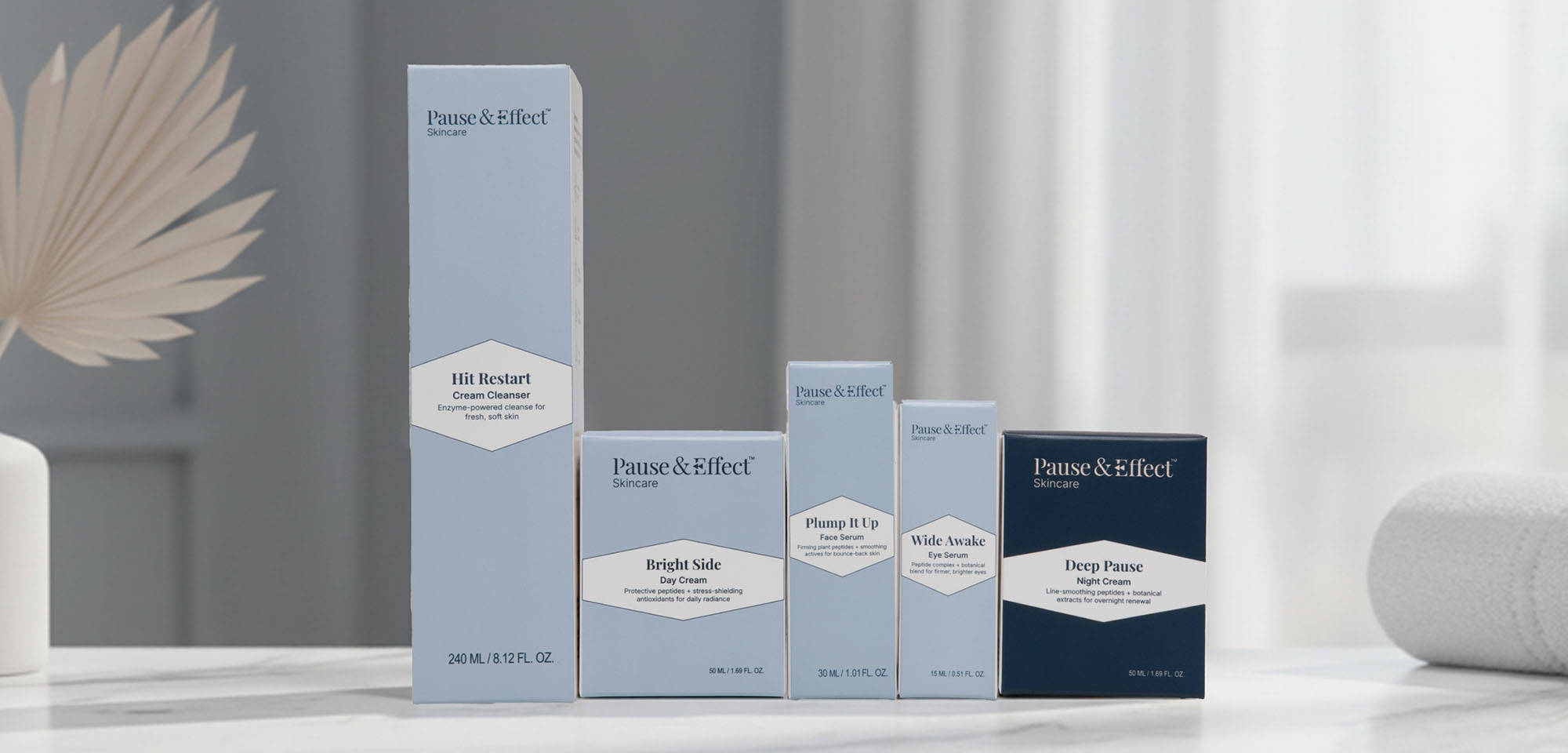
Five-product packaging design and production artwork
The Menopause Store website redesign
Amazon Brand Storefront and PDP design
Product, ecommerce, and marketing imagery
AI-assisted image generation and creative workflows
Approach :
Defining the Brand Direction
Early visual exploration began around The Menopause Store, but as the skincare launch became the immediate business priority, that direction evolved into the Pause & Effect identity. I developed the logo system, typography, color palette, supporting graphics, and brand guidelines to create a distinct skincare brand that felt elevated, credible, and approachable.


Building the Product System
With production timelines driving the schedule, I translated the identity into a cohesive five-product packaging system, balancing consistency across the line with the practical needs of different formats, claims, ingredients, and product information.


Extending the Brand Online
I redesigned The Menopause Store’s existing Squarespace website, using the visual language developed through Pause & Effect to create a more cohesive relationship between the broader business, its educational content, coaching services, and skincare line.


Building the E-commerce Experience
I carried the Pause & Effect system into Amazon, designing the Brand Storefront and Product Detail Page graphics to communicate benefits, ingredients, clinical claims, brand values, and the recommended five-step routine in a consistent shopping experience.


Impact :
Pause & Effect grew from a new five-product skincare concept into a cohesive, launch-ready brand spanning identity, packaging, web, Amazon, e-commerce imagery, and marketing. The connected visual system gave the line a distinct and credible presence while creating a consistent experience from product packaging to digital shopping.
More Projects


Branding
Pause & Effect Skincare
Built a new skincare brand across identity, packaging, web, and ecommerce.
Year :
2025 - 2026
Industry :
Beauty & Wellness
Company :
The Menopause Store
Role :
Brand Strategist & Designer
Challenge :
The Menopause Store, a midlife wellness brand, was expanding beyond education and coaching services with a proprietary five-product skincare line designed specifically for midlife skin. The new line had firm production timelines and significant business potential, so it quickly became the priority.
The challenge was to create a brand that felt credible and elevated enough for science-backed skincare, while still feeling warm, approachable, and aligned with the broader Menopause Store experience.
Solution :
I developed the Pause & Effect identity by evolving the visual direction originally being explored for The Menopause Store into a more distinctive, product-ready brand system.
The resulting identity became the foundation for the skincare line across packaging, e-commerce, Amazon, product imagery, and marketing, while also helping shape the visual direction and redesign of The Menopause Store website.
My Contributions :
Brand direction and visual identity development
Logo, typography, color, and supporting graphic system
Brand guidelines
Five-product packaging design and production artwork
The Menopause Store website redesign
Amazon Brand Storefront and PDP design
Product, ecommerce, and marketing imagery
AI-assisted image generation and creative workflows
Approach :
Defining the Brand Direction
Early visual exploration began around The Menopause Store, but as the skincare launch became the immediate business priority, that direction evolved into the Pause & Effect identity. I developed the logo system, typography, color palette, supporting graphics, and brand guidelines to create a distinct skincare brand that felt elevated, credible, and approachable.
Building the Product System
With production timelines driving the schedule, I translated the identity into a cohesive five-product packaging system, balancing consistency across the line with the practical needs of different formats, claims, ingredients, and product information.
Extending the Brand Online
I redesigned The Menopause Store’s existing Squarespace website, using the visual language developed through Pause & Effect to create a more cohesive relationship between the broader business, its educational content, coaching services, and skincare line.
Building the E-commerce Experience
I carried the Pause & Effect system into Amazon, designing the Brand Storefront and Product Detail Page graphics to communicate benefits, ingredients, clinical claims, brand values, and the recommended five-step routine in a consistent shopping experience.
Impact :
Pause & Effect grew from a new five-product skincare concept into a cohesive, launch-ready brand spanning identity, packaging, web, Amazon, e-commerce imagery, and marketing. The connected visual system gave the line a distinct and credible presence while creating a consistent experience from product packaging to digital shopping.
More Projects
Branding
Pause & Effect Skincare
Built a new skincare brand across identity, packaging, web, and ecommerce.
Year :
2025 - 2026
Industry :
Beauty & Wellness
Company :
The Menopause Store
Role :
Brand Strategist & Designer
Challenge :
The Menopause Store, a midlife wellness brand, was expanding beyond education and coaching services with a proprietary five-product skincare line designed specifically for midlife skin. The new line had firm production timelines and significant business potential, so it quickly became the priority.
The challenge was to create a brand that felt credible and elevated enough for science-backed skincare, while still feeling warm, approachable, and aligned with the broader Menopause Store experience.
Solution :
I developed the Pause & Effect identity by evolving the visual direction originally being explored for The Menopause Store into a more distinctive, product-ready brand system.
The resulting identity became the foundation for the skincare line across packaging, e-commerce, Amazon, product imagery, and marketing, while also helping shape the visual direction and redesign of The Menopause Store website.
My Contributions :
Brand direction and visual identity development
Logo, typography, color, and supporting graphic system
Brand guidelines
Five-product packaging design and production artwork
The Menopause Store website redesign
Amazon Brand Storefront and PDP design
Product, ecommerce, and marketing imagery
AI-assisted image generation and creative workflows
Approach :
Defining the Brand Direction
Early visual exploration began around The Menopause Store, but as the skincare launch became the immediate business priority, that direction evolved into the Pause & Effect identity. I developed the logo system, typography, color palette, supporting graphics, and brand guidelines to create a distinct skincare brand that felt elevated, credible, and approachable.
Building the Product System
With production timelines driving the schedule, I translated the identity into a cohesive five-product packaging system, balancing consistency across the line with the practical needs of different formats, claims, ingredients, and product information.
Extending the Brand Online
I redesigned The Menopause Store’s existing Squarespace website, using the visual language developed through Pause & Effect to create a more cohesive relationship between the broader business, its educational content, coaching services, and skincare line.
Building the E-commerce Experience
I carried the Pause & Effect system into Amazon, designing the Brand Storefront and Product Detail Page graphics to communicate benefits, ingredients, clinical claims, brand values, and the recommended five-step routine in a consistent shopping experience.
Impact :
Pause & Effect grew from a new five-product skincare concept into a cohesive, launch-ready brand spanning identity, packaging, web, Amazon, e-commerce imagery, and marketing. The connected visual system gave the line a distinct and credible presence while creating a consistent experience from product packaging to digital shopping.